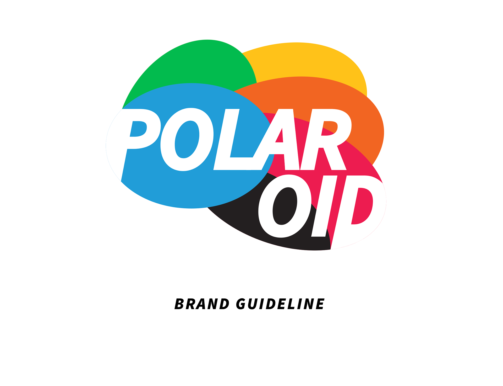
ILLUSTRATOR + INDESIGN
This project was for graphic design development at NWTC.
The goal was to pick a brand of our choosing and creatively redesign it.
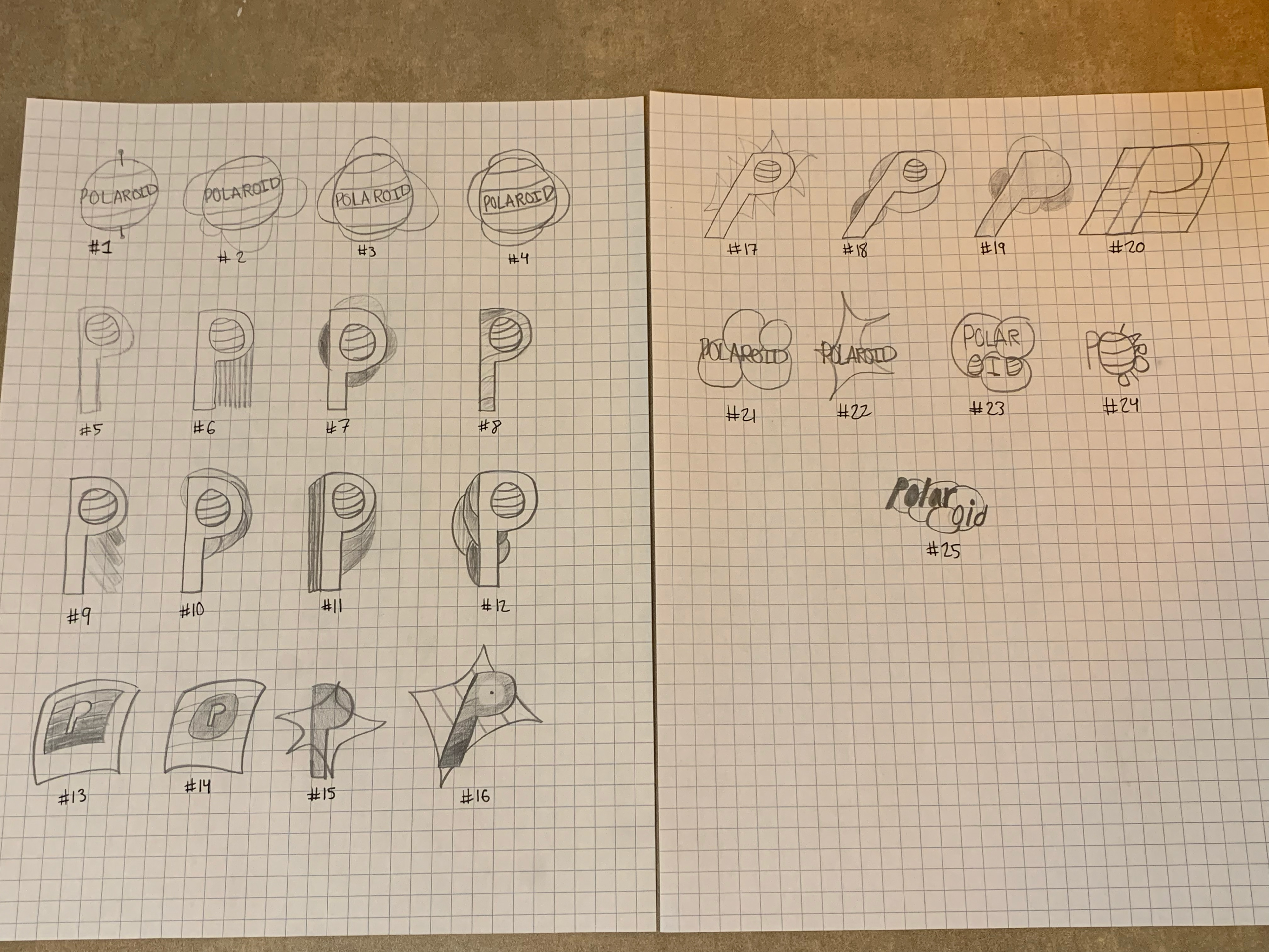
Sketching was an important start to this campaign, as it allowed possible ideas to flow freely.
REASONING:
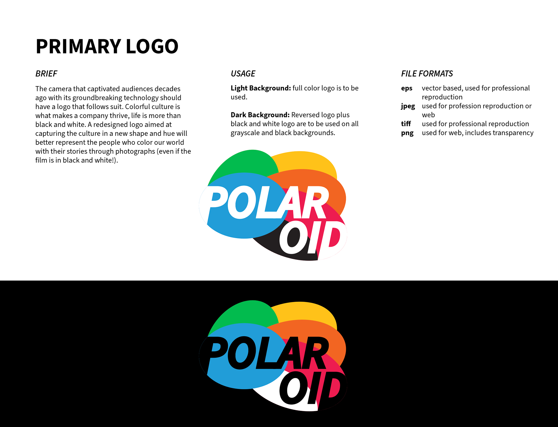
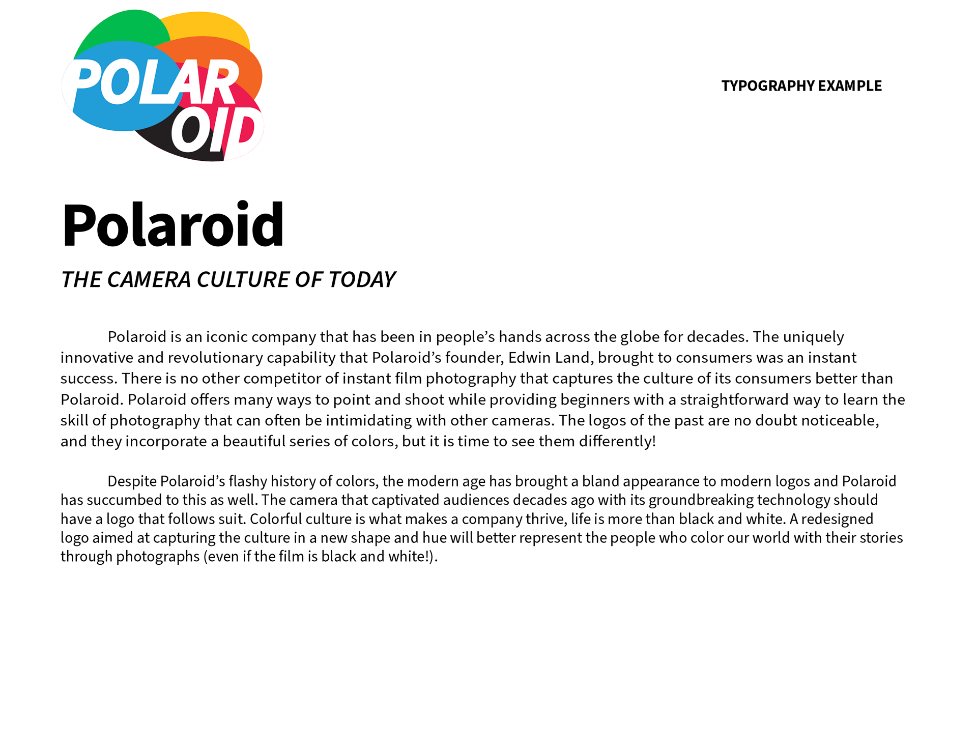
Despite Polaroid’s flashy history of colors, the modern age has brought a bland appearance to modern logos, and Polaroid has succumbed to this as well. The camera that captivated audiences decades ago with its groundbreaking technology should have a logo that follows suit. A colorful culture is what makes a company thrive; life is more than black and white. A redesigned logo aimed at capturing the culture in a new shape and hue will better represent the people who color our world with their stories through photographs (even if the film is black and white!).
DESIGN BRIEF:
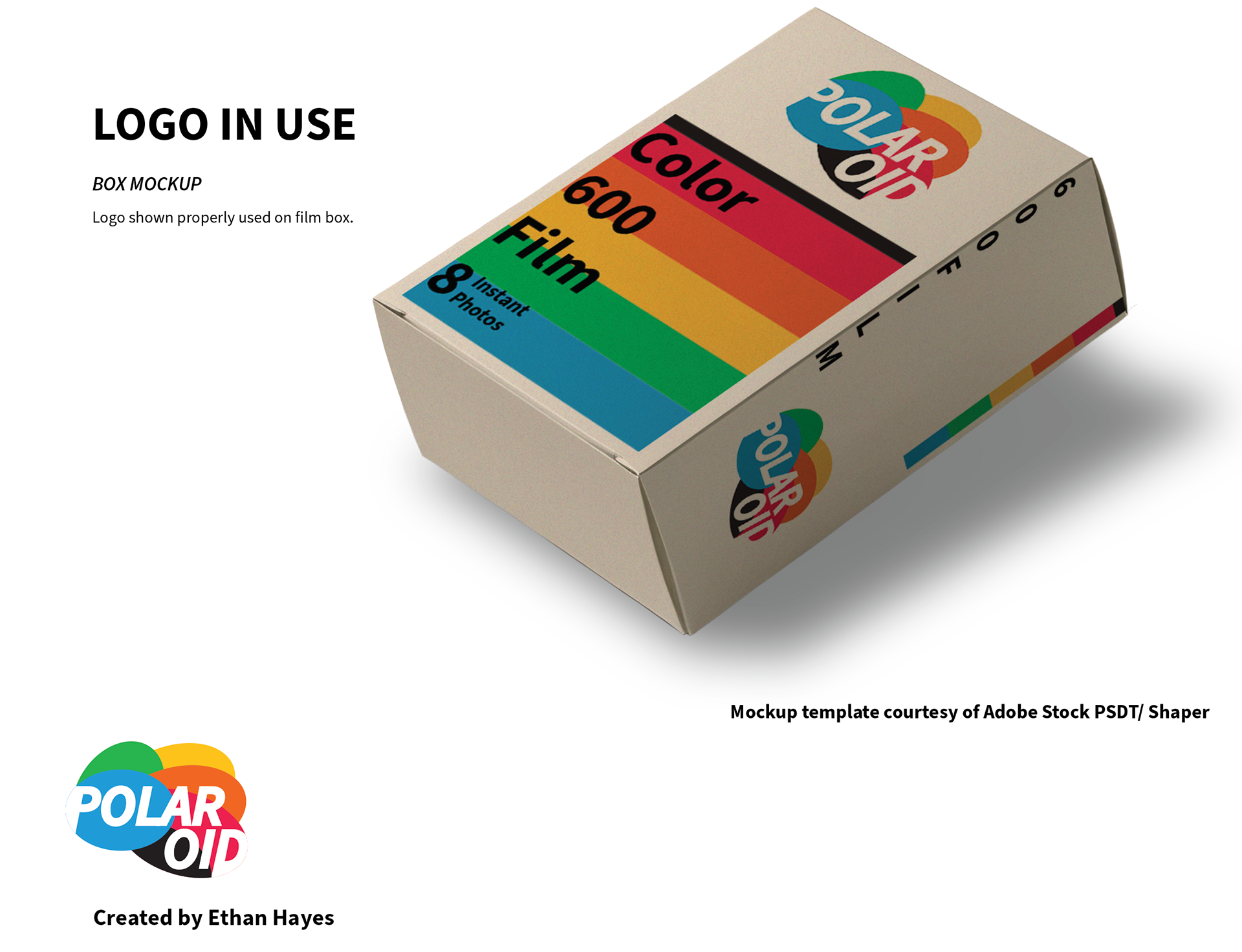
For this redesign, we are not looking within, but rather from above and out, at a global perspective. I want to represent all the colorful cultures that make Polaroid the popular revived brand that it is today. Polaroid’s target audience is the creators of today and these creators tell their stories through Polaroid photographs. Polaroid was as good as dead in 2008 due to the ever-changing digital world we live in, but thanks to some dedicated people who revived the company, it has blossomed after a resurgence of love for film and instant photography. Polaroid is so unique that it deserves a refreshed logo to represent that thoroughly while still representing and respecting past generations of Polaroid.